I really love playing Endless Space. The UI is really frictionless in that it’s always pretty easy to get the information you need but is otherwise unobtrusive. A few simple principles in the interface make Endless Space really engrossing. In short, Endless Space:
- Makes it easy to access information you need
- Keeps the context of your decisions clear
- Uses well-crafted icons to make your decisions as unambiguous as possible
Like many strategy games, ES puts a toolbar at the top of the screen. Each button represents typical strategy game stuff—taxation/empire overviews, research, military and ship design, diplomacy and special “hero” units—but what makes this really useful is how the toolbar is always present and always gives you a quick tooltip summarizing the most important information in each tab. Just hovering over the Empire tab will tell you your income, and hovering over the Military tab tells you your total strength as well as rankings compared to other empires. This may sound like small potatoes, but the tooltip is much more expressive than some of ES’s competitors:
Galactic Civilization 2’s toolbar spreads across the entire bottom of the screen. Tooltips only indicate what each button does. The graph above the buttons gives a really generalized view of each civilization’s progress over time, which isn’t useful when you want to know if your tax income is killing morale.
ES keeps relevant information close together and quickly accessible. In ES, my tax balance is shown above the tax management button, and has a green little smiley face to indicate my empire is happy, whereas GC2 keeps the balance tooltip on the far left, even though you need to go to the middle of the screen to change it. You can’t tell just by looking at the screen where to find a mood summary. On top of that, the entire interface is buried under a giant graph which isn’t really useful for turn-to-turn management.
At the beginning of every turn, ES stacks all the information you need next to the End Turn button.
When your turn starts, everything that needs your attention just sits there unopened until you take a look at it. Here, from top to bottom, the notifications are telling me that another player has something to say to me, that my science research is done, that I have two completed constructions and, slightly to the left of the End Turn button, I have two ships without orders. Just from a glance at the icons, I know exactly what needs to happen this turn.
To be fair, GC does have a notification icon too:
It’s a ship launch reminder / new ship finder. Planets also get a green globe when they’ve completed construction, but these notifications don’t stack, so you can easily end up with 30 of these if you’ve finished 30 ships on 30 planets. They aren’t readable at-a-glance, either. Every completed construction uses the same icon. Most importantly, GC’s stack isn’t inclusive of everything I need to do in a turn, but we’ll get to that in a second.
ES’s Completed Constructions window, accessed from the notifications above, is also really great. It very clearly lets you know when a planet’s queue has run out:
See? The next box is empty! Damn, I should really do something. Fortunately, clicking on a row will take me right to the planet so I can start editing the queue. Once I come back to the notice, it’s updated with whatever I added. This makes it really easy to just scan for empty blocks in the queue to know what I still have to do in each turn. If I want to leave this screen and come back, “minimize” returns the notification to my tray so I can get back to it later. This is useful when I want to check on a planet’s location to decide between making sensor arrays for border planets or ships for more centrally located planets.
Remember how GC doesn’t give you a notification icon for every task you need? That’s because it pops a giant box up at the start of a turn:
A few points in comparison to ES:
1) You can’t see what is next on the planet’s production queue for ships. This is because ships just repeat production endlessly. For buildings , you can see what’s next, but
2) For buildings, the queue doesn’t get updated when you change production of a planet. If I go to a planet to change production and come back, it will still report my planet as not having any construction planned for next turn. Speaking of going to planets...
3) You can’t click or double-click on the event listing to get to the planet, you have to select the right item and click “go to” in the bottom right. Once you click “done”, this screen becomes inaccessible for the rest of your turn.
Speaking of planets!
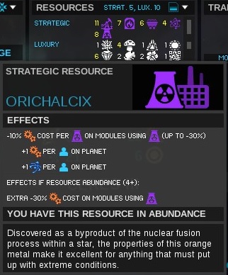
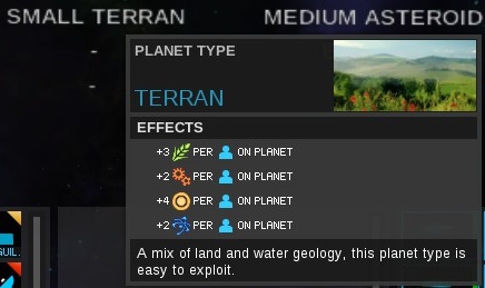
Endless Space extends its wonderful tooltips to the system management screen. Every output from a system can be moused over to see the breakdown of elements, and every bonus or penalty is clearly accounted for.
This also applies to resources found on planets, and the planet types themselves:

GC has something similar, but it’s cramped. ES lays out accumulated values like an accounting ledger from top to bottom. This lets the numbers line up so you can scan the column at a glance and see where your big bonuses and penalties are coming from. GC muddles its message with asides like, “You are only charged for half of this”. I don’t know what “charged” actually means in this context. A penalty to money? To production time? 
Also, GC is more reliant on text than ES. This leads to ambiguous situations like this bonus on my planet:
“Influence bonus: Any cultural district built here will receive a boost in its effectiveness”. Okay, fair enough, but...
Which of these buildings will get the boost? There is no “cultural district” listed. There is a “planetary influence” building, and a “influence” building. Will either of them get the bonus?
The building description at the bottom of the screen gives some insight, finally[1].
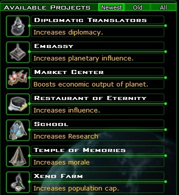
ES avoids ambiguity by relying on iconography. Because each planetary resource (production, dust, science, food) has a color and icon associated with it, it’s very easy to tell at a glance what any given building does. And the tooltip you get for any building is quick to resolve any ambiguity:
The marker in the upper left of each building is color-coded according to what resource it helps develop. The tooltips use the same icons found in the system status screen to unambiguously define the exact effect a building has, as well as any negative effects. If you’re colorblind, the triangles might not be too helpful, but that’s where the icons and tooltips come in.
So how can we summarize the UI decisions Endless Space has made versus those of Galactic Civilization 2?
- Show the player the information they need in a way that’s easy for them to access.
- Useful information tends to be values that directly affect player decisions, like net income, rankings or morale.
- Sprawling graphs can probably hide behind a menu.
- When you want to grab the player’s attention, use consistent messaging that makes the context clear.
- Make it easy for the player to take action directly from the notification.
- If you’re presenting information that needs action taken, keep that information up to date so the player doesn’t lose track of their progress.
- Try not to rip the player’s context away through use of full-screen windows or unclear notifications
- Icons and color-coding can prevent ambiguous wording from complicating player decisions.
- Keeping consistent iconography through the game can make decision making much easier by keeping related concepts linked in the player’s mind
[1] As an aside: There’s a game design issue where GC loves giving percentage-based bonuses, rewarding exploration with 1% increases to this or that, and buildings that increase a value by “15%”. Someone once wrote a great article about why this is not as clear and effective as whole-value bonuses, but I’ll be damned if I can find it. In short, though: a percentage bonus makes me do division, rounding and addition in my head, whereas additive bonuses are much easier to figure out.
